For those who are trained in design for web in the traditional sense; websites that primarily are visited by a user using computer with a browser designing for small screens demands a new set of skills. When designing for mobile devices and small screens, our opinion is that there is a different structure, use of symbols, and ”flows”. Obviously it’s all about the background, knowledge and experience that the designer has.
Image and Icon language
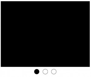
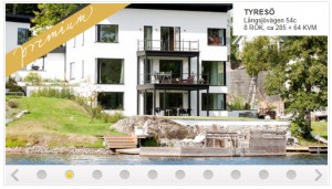
Image and icon language is different in design för small screens compared to the traditional design. The surface constitute great demands on the compression of information. The underlying technology is among other aspects the touchscreen requests other visual grip. As an example, the following symbol is given; the symbol with three dots where one is black is used to show that there are more than one pictures to see (picture 1). The user use his/hers fingers on the touchscreen to see moore images. In this case the symbol is interpreted as an image of three is shown. A similar imagery is shown below (picture 2) and visualizes a design for the computer screen with the difference that there are arrows to click on.
Figure 1. Image from our mock-up. Shows how we worked with a symbolic language for smartphone, small screen and touchscreen
Figure 2. Shows the how the publicist visualized that there are more images for the user to see. Note the arrows on the right and left of the dots.
Underlying technology
I experience that there is an even complex IT infrastructure designing for smartphone and small screens. While a website interacts with the underlying publishing system the application for smartphone increasingly interact with a number of functions in the hardware – the smartphone. Features like Accelerometer, Camera, Compass, Geolocation, Notification (Alert), Notification (Sound), Notification (Vibration), Storage and are a central part of the design process and possibilities. It is common that when a application not are open program so that information is displayed in the hardware, the phone it still operates. Various forms of notifications communicates with the user.. An icon will appear in the phone when a new message or in our case, a request for item are located. An application of this kind is not only comparable to a web page that the user visits. It can also be described as software that works but does not show until something interesting happens.
Consequence for the designer
It could be understood that we are faced with an even higher pressure or demands for requirement to understand and have general knowledge of strategy, design, content, technology, to be able act creatively and professionally as designers. A basic understanding of how technology works are required but also knowledge abouthow the technology are used. It seems more and more important to understand different phenomenon caused by new technology.
The limited display area places high demands on an understanding of how the different functions of providing access to information and interaction. For this reason it is a very central feature of the design process. If we accept the view that an app is not just a web page that we visit, which we discussed in above, but also constitute a program that continually work for us needs these dimensions to addressed by the designer and these skills are similar to more advanced programming skills.
The limited surface makes it difficult to work with text and characters and we see a need to use some form that is even more compressed than the alphabet. The solution seems to be to use images or icons. This model of communication is similar to a system of symbols or pictures which was used 30,000 years ago. In this way of communication system symbols are representing linguistic expressions. A symbol shaped like a fish meant just fish. The Sumerian cuneiform, Egyptian hieroglyphs, the Chinese script, are examples of picture writings. Is the direction we are going?


